
The Kano Model Explained: Must-Be, Performance and Delighters, From Induction Ranges to MagSafe and Airline Wi-Fi
- The Kano model treats satisfaction and dissatisfaction as separate dimensions, not one line.
- Must-be features only prevent complaints, performance features scale with delivery, and delighters surprise customers.
- A paired functional and dysfunctional question for each feature classifies it, and categories decay over time.
Contents
The Kano model sorts product features by how they move customer satisfaction: must-be features only prevent complaints, one-dimensional (performance) features make people happier the more you deliver, and attractive features, or delighters, thrill people who never asked for them. It explains a frustrating truth every product team learns: you can nail the basics and still get zero praise. It also explains why today's wow feature, like airline Wi-Fi or a magnetic phone charger, quietly turns into tomorrow's bare minimum.
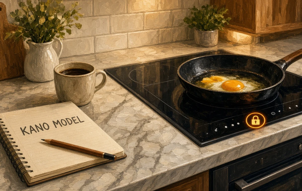
This guide covers where the model came from, how each quality category is defined, how to run a Kano survey with functional and dysfunctional question pairs, and how to read the results, using induction ranges, iPhone MagSafe, the Dyson Airwrap, airline Wi-Fi and SaaS onboarding as running examples.
Why do companies use the Kano model?
Customer needs have splintered, and feedback now arrives through app-store reviews, Reddit threads, TikTok unboxings and support tickets rather than a single focus group. Teams need a way to decide which requests to build first. The Kano model answers a narrower but crucial question: if we add or improve this feature, will satisfaction rise, will complaints fall, or will nobody care?
Student money tip from CampusDown Repair UpMy Apartment Smelled Like Ramen and Old Socks — Stuffy apartment air fixes on a budget: open windows safely, run the range hood, cut pollution sources, control moisture, and know when to…
Getting that right is a market-share issue. Spend a quarter polishing a must-be feature and your NPS barely moves; ignore one and churn spikes. Ship the right delighter and reviewers do your marketing for free.

Where does the theory come from?
The model was introduced by Noriaki Kano and colleagues (Seraku, Takahashi and Tsuji) in a 1984 paper, "Attractive quality and must-be quality", in the journal of the Japanese Society for Quality Control. Kano, a professor at Tokyo University of Science, built on Frederick Herzberg's two-factor theory of job satisfaction, which argued that satisfaction and dissatisfaction are driven by different factors rather than sitting on one line. See Herzberg's two-factor theory for the original idea.
Kano's key move was to apply that to products: "not satisfied" is not the same as "dissatisfied". A hotel with clean sheets does not earn applause; a hotel with dirty sheets earns a one-star review. That asymmetry is the whole model in a sentence.
Skimming the section headings first makes a long guide much easier to map out. Try writing down one question of your own as you read.
How are the Kano quality categories defined?
| Category | If present | If absent | Example |
|---|---|---|---|
| Must-be (basic) | Taken for granted | Strong dissatisfaction | A phone that holds a call; a backup camera in a new US car (mandated by NHTSA since 2018) |
| One-dimensional (performance) | More is better | Less is worse | Battery life, broadband speed, induction boil time |
| Attractive (delighter) | Pleasant surprise | No complaint | MagSafe's snap-on charging in 2020; the Airwrap's air-curling in 2018 |
| Indifferent | No effect | No effect | A cooktop's internal coil brand |
| Reverse | Annoys people | Pleases people | Autoplay video ads, forced account sign-up |
The core insight about must-be features is that customers buy the product because of them, so having them earns no credit. Nobody writes "Five stars, the fridge keeps food cold."
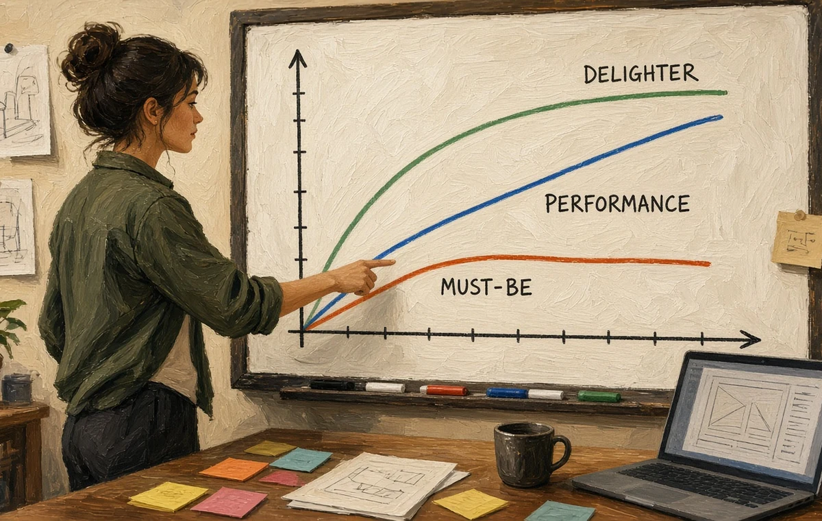
On the classic chart, the horizontal axis is how fully a feature is delivered and the vertical axis is satisfaction. Must-be curves rise from deep negative but flatten near zero; performance is a straight diagonal; delighters start at zero and curve upward fast.
How do you run a Kano survey step by step?
A Kano survey asks two questions for each feature: a functional question (how do you feel if the product has it?) and a dysfunctional one (how do you feel if it does not?). Respondents pick from five answers: I like it, I expect it, I am neutral, I can tolerate it, I dislike it.
- List 10 to 20 candidate features in plain language, one benefit per item.
- Write the question pair. For a SaaS dashboard: "If the app sends a weekly summary email, how do you feel?" and "If it does not, how do you feel?"
- Show, don't just tell. Add a one-line description or a mock screenshot so people react to something concrete.
- Keep answer order identical across all items to reduce errors.
- Recruit enough people per segment, ideally at least a few dozen for a class project and more for real decisions.
- Classify each response with the evaluation table, then take the most frequent category per feature.
| If present | If absent | Category |
|---|---|---|
| Like | Dislike | One-dimensional |
| Like | Neutral or tolerate | Attractive |
| Expect, neutral or tolerate | Dislike | Must-be |
| Neutral | Neutral | Indifferent |
| Dislike | Like | Reverse |
| Like | Like | Questionable (probably misunderstood) |
Then compute two coefficients from the counts (Berger and colleagues, 1993). Better = (A + O) / (A + O + M + I) shows how much satisfaction rises if you add the feature. Worse = -(O + M) / (A + O + M + I) shows how much dissatisfaction grows if you leave it out. Plot Better on one axis and the absolute Worse value on the other, and your roadmap priorities become a scatter chart.
If many answers land in "questionable", rewrite the question before trusting the data; jargon and double-barrelled items are the usual culprits.
How does the model apply to induction ranges?
Induction cooktops are a perfect American case study right now. The 2023 gas-stove debate over indoor air quality, local all-electric building codes, and Inflation Reduction Act rebates of up to 840 dollars for electric or induction ranges pushed many households to switch. People choose induction because there is no combustion in the kitchen, it boils water faster than gas, there is no open flame, and the flat glass wipes clean.
Student money tip on CampusDown Repair Up: My Apartment Smelled Like Ramen and Old Socks.
| Feature | Likely category today | Why |
|---|---|---|
| Auto shut-off and child lock | Must-be | Safety is assumed; its absence is a deal breaker |
| Boil speed and precise low simmer | One-dimensional | Faster and finer is always better |
| Residual-heat warning light | Moving from attractive to must-be | Now standard on most models |
| Bridge zones for griddles, app-guided cooking | Attractive | Few buyers ask, many are delighted |
| Loud cooling-fan noise | Reverse | Users actively dislike it |
The analysis tells a brand where to stop spending (meet the must-bes, then move on), where to compete head-to-head (performance), and where to stand out (delighters). In the UK, where induction hobs are already common, the same survey often shows boil speed slipping toward must-be and flexible zones carrying the delight.
Splitting respondents also matters: a single renter in Manchester and a family of five in Texas may classify the same feature differently, so segment before you average.
Why does today's delighter become tomorrow's must-be?
Kano's most practical lesson is that categories decay. Once competitors copy a delighter, it becomes performance, then must-be. In-flight Wi-Fi was a novelty in the late 2000s; today a dead connection on a five-hour flight gets the airline tagged on social media, and carriers such as JetBlue and Delta have made basic Wi-Fi free. MagSafe-style magnetic charging spread across accessories and the Qi2 standard. The rear-view camera went from luxury perk to legal requirement.

For SaaS and UX teams, the same thing happens with dark mode, single sign-on and autosave. So re-run the survey every year or two, watch which delighters are going stale, and keep a pipeline of new ones. Expectations also interact with satisfaction in other ways, as expectancy disconfirmation theory explains.
A good rule of thumb: meet every must-be, be competitive on the top two or three performance features, and invest a small, steady slice of the roadmap in delight.
Common mistakes
- Asking about features respondents have never seen or used.
- Writing long, jargon-heavy questions that trigger questionable answers.
- Averaging across very different user segments.
- Treating one survey as permanent truth.
Quick self-check
- Did you pair a functional and a dysfunctional question for every feature?
- Did you keep the five answer options in the same order?
- Did you calculate Better and Worse coefficients, not just tally categories?
- Did you plan a re-survey date?
Compiled by the CampusDown editorial team from Kano, Seraku, Takahashi and Tsuji (1984), Berger et al. (1993) and public information on US appliance rebates, NHTSA rules and airline policies. Reviewed November 2026. Product examples are illustrative; no brand affiliation.
FAQ
Who created the Kano model?
Noriaki Kano of Tokyo University of Science and colleagues introduced it in a 1984 paper titled Attractive quality and must-be quality.
What is the difference between must-be and one-dimensional quality?
Must-be features only prevent dissatisfaction and earn no praise, while one-dimensional features raise satisfaction steadily the more fully they are delivered.
How many questions does a Kano survey ask per feature?
Two: a functional question about having the feature and a dysfunctional question about not having it, each answered on the same five-point scale.
Why do delighters turn into must-be features?
Once competitors copy them and customers get used to them, expectations rise. Airline Wi-Fi and rear-view cameras are classic examples.
What are the Better and Worse coefficients?
Better is (A+O)/(A+O+M+I) and shows potential satisfaction gain; Worse is -(O+M)/(A+O+M+I) and shows potential dissatisfaction if the feature is missing.